Hi, I'm Will Pancake
Product Designer based in Logansport, IN
Who I am
I'm a Product Designer because I have a passion for understanding the problems of everyday people and figuring out how to solve them digitally in a simple and effective way.I'm based in Logansport, Indiana as I search for a design team that I can serve as a part of. My other interests include playing guitar, brewing craft coffee, and trying new foods.If you're interested in learning more about my work, collaborating on a project, or talking about a role that I could fill on your team, then please feel free to send me an email at [email protected] and download my resume.

Modernizing Vehicle Browsing
Scrolling through endless content on social media has become second nature to most people. There’s something about large imagery coupled with positive interactivity that keeps us engaged on these platforms.How can this phenomenon be applied to an automotive sales platform to engage the users in a more meaningful way — leading to more time spent on the app, more transactions, and more satisfied customers?
overview
The client and my role
Carstream is an up-and-coming automotive sales platform that focuses on providing the same services and peace of mind that you get with buying from and selling to a dealer, minus the dealer. The company is currently in the pre-seed stage of development with an initial website and app already built.Scope: Redesigning the browse screens (browse, search, and vehicle details)
Stakeholders: CEO, CTO, Project Manager
Duration: May 22nd 2023 - June 12th 2023 (14 days)

objective
The "why" behind the project
Going into this project, I had one objective in mind on behalf of the end-user:To make the vehicle browsing experience more engagingThe more engaged a user is while browsing for vehicles, the more likely they'll be to actually purchase one.

part 1
From buying to browsing
The old buy screen on the Carstream App was aimed at helping users search for and buy vehicles. It was utilitarian, requiring the user to search to see vehicles.To transform this screen from a utilitarian one into an engaging one, I had to reframe the layout from one meant for buying to one meant for browsing.
Research
Using adjacent innovation
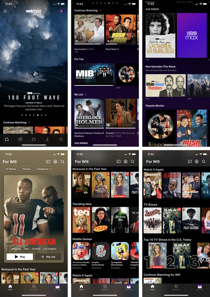
When researching how to make the browse screen more engaging, I found myself intrigued with TV streaming services. I looked to apps like MAX, Hulu, and Netflix to see how they managed to organize their vast catalogs of shows and movies into easily digestible lists.All three apps seemed to have two elements in common:
- Lists of movies are placed in horizontally scrollable rows
- Featured movies are larger and include more details
Whiteboarding
Reframing the features
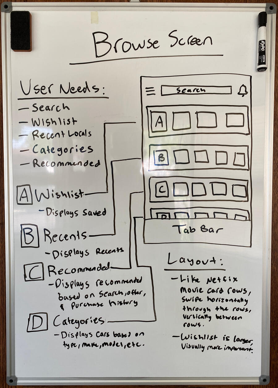
Inspired by the streaming services, I began to put pen to paper on how their innovations could be used in our app.To begin I made a list of the user’s needs for the browse screen based on the old app and current website. My objective wasn’t to create new features but to reframe the existing ones in a more engaging way.After listing the user's needs, I sketched out how the adjacent inspiration could be applied to meet them.
Iteration
Drafting for the future
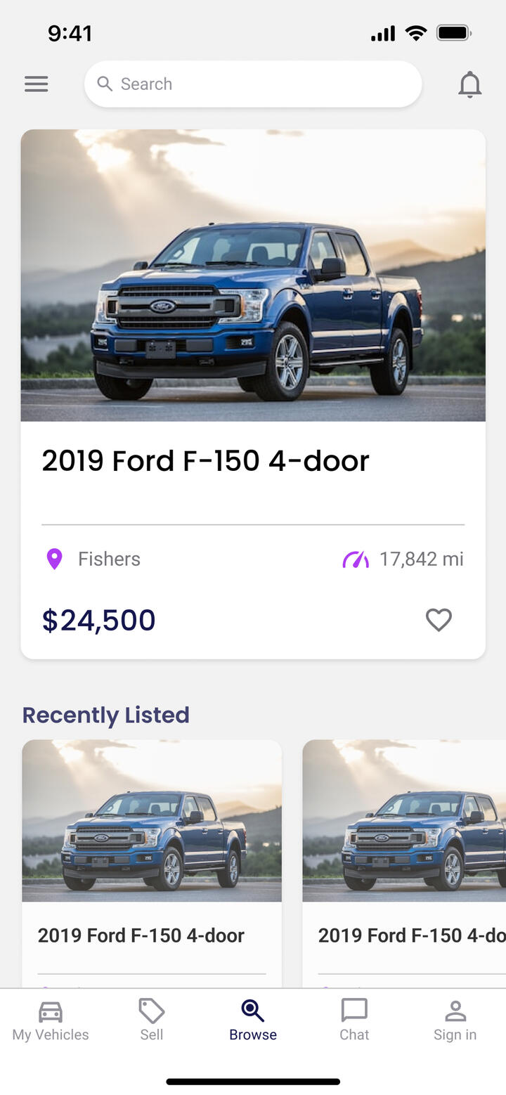
After updating the mobile design system to match the new one on the website, I drafted vertically oriented vehicle listing cards that emphasized the image and contained only the basic details that the user needs to know to decide whether or not to click on a vehicle listing.Then I began to design the layout of the new browse screen, utilizing the horizontal scrolling rows and large featured content. The thought here was that the featured content could be boosted (paid) listings and other premium content.After reviewing with my project manager, we determined that this type of varied layout would be best used at a later point when we have the support for that premium content.
Further Research
Adjusting my approach
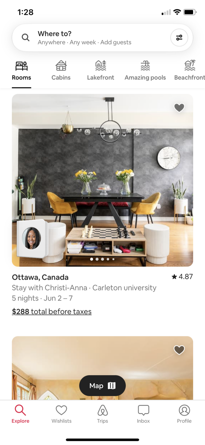
Based on the feedback I received, I needed to remove the featured content cards. This presented a new problem because now the screen felt very monotonous since it was just a bunch of rows containing vehicle cards. I needed to adjust my approach and return to the research phase.Enter Airbnb and its use of the tablist component on its explore screen! This approach uses vertically scrolling lists that can be toggled between via a simple swipe or tap.This explore screen is a prime example of the engagement phenomenon that I described at the start of this case: large imagery coupled with positive interactivity.
Design execution
Vehicle browsing, reimagined
I designed the next iteration of the browse screen, with a layout inspired by my continued research into the explore screen of Airbnb. In comparison to the previous iteration, this one had a more consistent information architecture, easier access to different lists, and simpler navigation features.
part 2
Simplifying the search
The old search screen on the Carstream App was on the right track in terms of functionality, but it lacked the interactivity needed to keep the user engaged.To increase the interactivity of the search screen, I had to reimagine how the filters could be presented, applied, and removed.
Whiteboarding
Reusing components
After listing out the users' needs, it became clear that the main ways to engage with this screen were through the search results themselves, and the filters that could be applied.To keep the layout consistent with the new browse screen, I kept all of the same components except for the tab list, which was swapped out for a row containing filter drop-downs.I chose to keep the floating action button that toggles the map view from the old search screen, as it was an effective implementation of the map view feature.

Iteration
Creating new problems
Reusing the same components from the browse screen, I created a layout resembling the search screen I sketched during whiteboarding and updated the map view with modern components.It featured a horizontally scrolling list of filter drop-downs. I figured this solution would work well to preserve space and eliminate an extra screen. However, what I didn't realize was the filter drop-downs created a new set of problems: excess scrolling and repetitive selection methods.After reviewing with my project manager, we determined that the filters deserved their own screen after all (like on the old screen!).
Research
Making filters visual
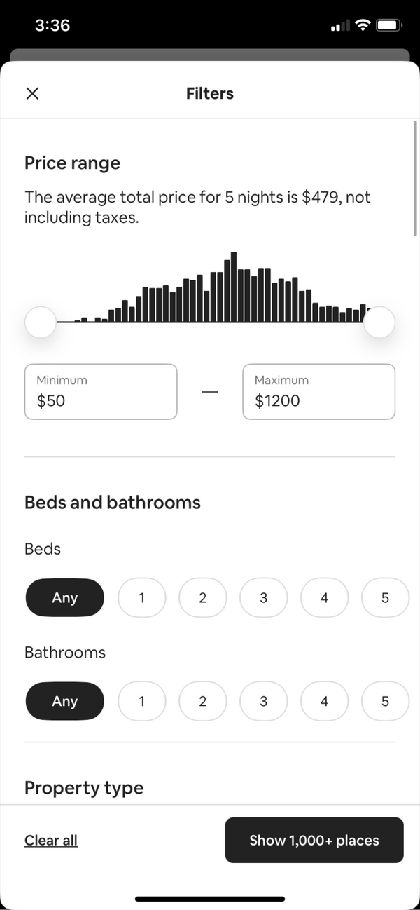
Now that I was back to square one with the filters, I decided to conduct more research to see how to handle a long list of filters. I decided to return to Airbnb for inspiration.As shown, they ditched the ordinary checkboxes, radio buttons, and sliders and instead opted for more visual versions of each selection method, which solves the repetition problem.Additionally, the entire list is contained in a bottom sheet featuring a fixed footer that has the clear and show buttons, which helps to alleviate the excessive scrolling problem.
Design execution
Search filters, refreshed
I designed the next iteration of the search screen, with the new filters bottom sheet being a combination of the old design, my first iteration, and inspiration from my research. I also added a feature on the updated map view that shows a smaller preview version of a vehicle card when you click on its location pin.
part 3
Making vehicle details engaging
The old vehicle details screen on the Carstream App displayed outdated information in a repetitive way that made it difficult for the user to quickly scan for information.To update the details and make them more engaging, I had to rethink the information architecture to support what's currently on the website and how to display it in an engaging way.
Research
Looking for a better way
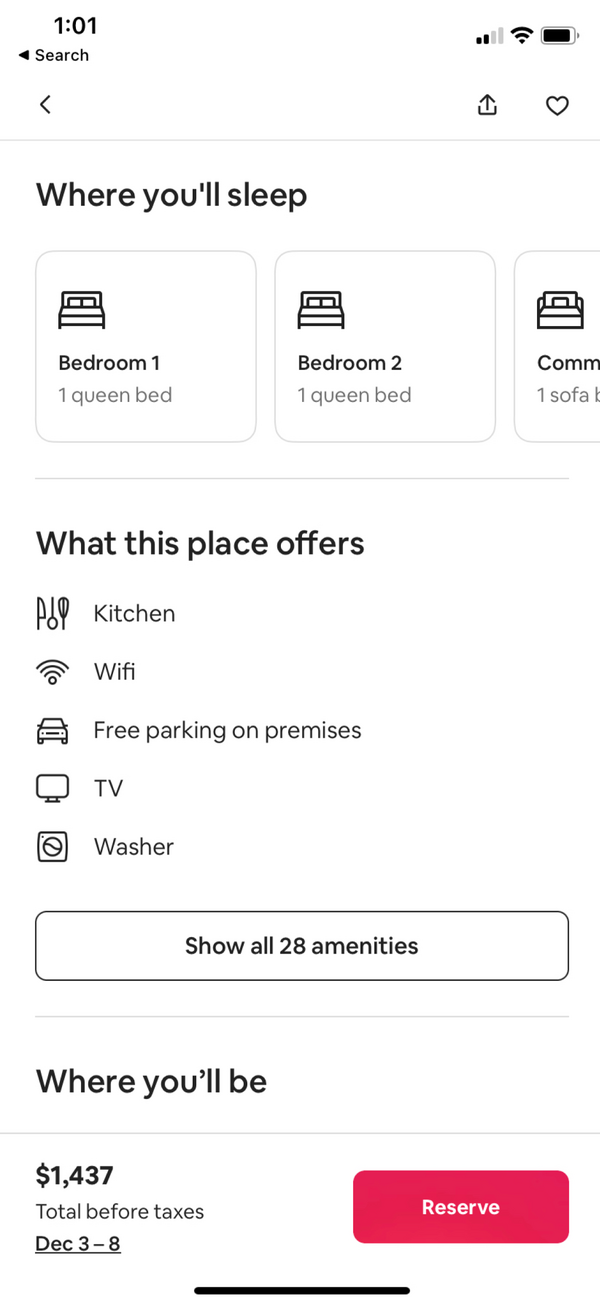
I knew that I wanted to make the information more visual and engaging, but I wasn't quite sure how. So I decided to return to the primary inspiration for this project so far — Airbnb.Being vacation rentals, their listings have a large amount of information to display, but they manage to do so in a simple and engaging way.Some patterns I noticed included the use of cards and labeled icons, both of which contained information that would likely have been otherwise in a set of tables.
Whiteboarding
Keeping it consistent
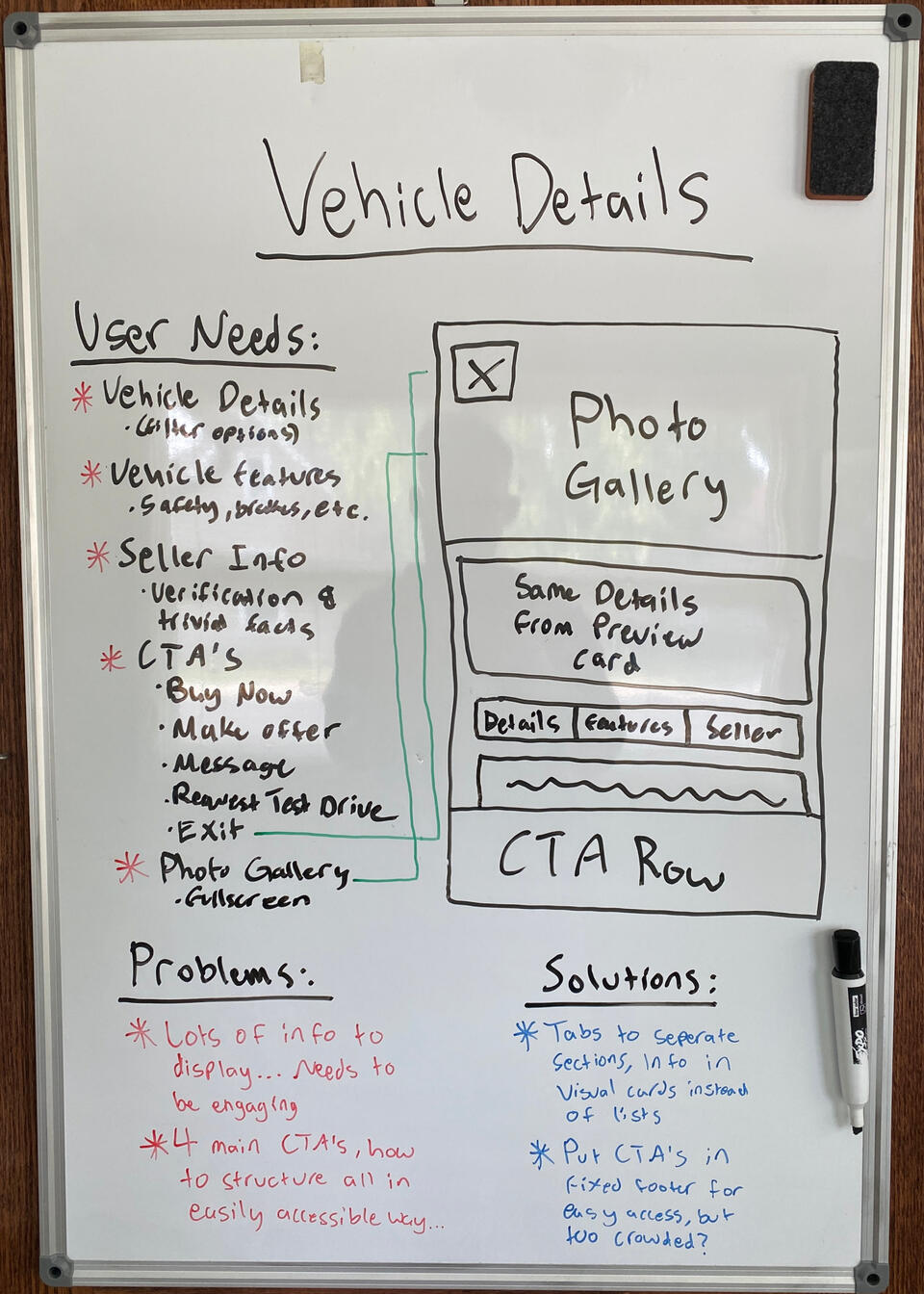
Once I listed out the users' needs and began to sketch the layout, I realized that the top part of this screen could resemble the preview card, which provides consistency from screen to screen.To reduce the amount of scrolling, I decided to divide the information into 3 tabs that could be toggled between. This provided separation of information while reducing scrolling.I decided it was best to keep the buttons in a fixed footer for easy access, but I wanted to reconsider them toggling a full screen.
Design execution
Vehicle details, restructured
I designed the next iteration of the vehicle details screen, complete with a lightbox gallery view and the actions now contained in a compact bottom sheet. The bottom sheet is divided into two tabs: Message Seller and Make an Offer. The Message Seller tab is used for requesting test drives, updating requests, and asking questions. The Make an Offer tab is used for making and updating offers.
reflection
What I learned
Some of the normal steps in the design process such as user testing and impact analysis had to be omitted due to this client being at the pre-seed stage and not having any recurring users yet. Despite this, I was able to learn about what makes screens engaging for the user in one industry and apply those same concepts to the client's app in a completely different industry. Here are some of my main takeaways:- The ideal solution often comes from reframing the problem entirely
- Researching and whiteboarding should take place before opening Figma
- The first iteration shouldn't be the last one, keep reiterating until it makes sense
- Not every component needs reinvented, reuse the patterns that already work well
- Keeping designs compact is ideal, but not if it makes them harder to useMy one objective going into this project was to make the vehicle browsing experience more engaging. I would argue that I succeeded in that objective based on the resulting designs. However, I have a conflict of interest being the one who designed them, so I'd like to hear from you! Below is the link to a copy of the Figma file, check out the designs and leave some comments. Point out my mistakes and ask questions, it's how I learn! If you want to talk more about my work, send me an email at [email protected].
Streamlining Vehicle Pickup
There are a lot of intricate steps that need to be completed between buying or selling a vehicle online and exchanging the keys in person to ensure the safety and security of the transaction for both the buyer and the seller.How can these steps be simplified and clarified to bring together two strangers to successfully exchange the keys — leading to more completed pickups, more revenue, and a safer experience for the users?
overview
The client and my role
Carstream is an up-and-coming automotive sales platform that focuses on providing the same services and peace of mind that you get with buying from and selling to a dealer, minus the dealer. The company is currently in the pre-seed stage of development with an initial website and app already built.Scope: The vehicle pickup flow (the steps in between checkout and vehicle pickup)
Stakeholders: CEO, CTO, Project Manager
Duration: July 5th 2023 - July 14th 2023 (8 days)

objective
The "why" behind the project
Going into this project, I had one objective in mind on behalf of the end-user:To provide clarity to the vehicle pickup experienceWith an intricate process like this one, it's paramount the user knows what they're doing and why they're doing it, and it's my job to figure out how to show them.

Part 1
Mobile first approach
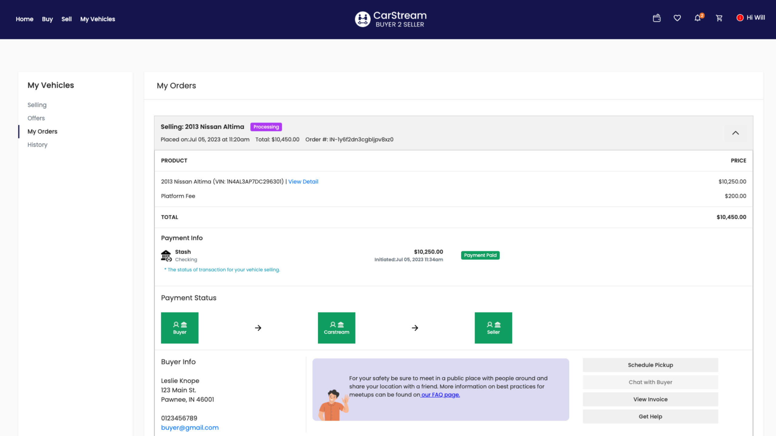
The vehicle pickup steps take place within an order accordion on the orders page. The problem with this is that each order contained lots of details and displayed them in a way that was hard to read and wasn't mobile-friendly at all.The first step towards providing clarity was to restructure the information architecture to display the same details but in a clearer and mobile-friendly format.
whiteboarding
Starting with mobile
Since vehicle pickup takes place in person, the orders screen must be optimized for mobile use. To accomplish this I started the redesign with a mobile-first focus.An iPhone 14 has 390px of screen width, but inside the orders accordion where the content in question is there's only 326px of screen width — not much to work with, unfortunately.While listing out the user's needs based on the old screens, it became clear that my biggest challenge in this project was going to be keeping this design as compact as possible while maintaining usability. To do this I needed to take it one section at a time.
Iteration 1
Reusing existing components
The order details section was straightforward because I was able to use a pricing summary card from the checkout redesign and repurpose it here, creating a familiar pattern.I was able to reduce the size of this component by removing unnecessary information like the VIN and only showing the name of the line item and its price.Additionally, It was important that I accounted for what is and isn't shown to each user in this component (buyer is charged with the platform fee, seller isn't).
Iteration 2
Clarifying payment status
One of the most important sections on this page is the payment status, which has the role of showing both the buyer and seller not only where the buyer's money is but also why it is.I took a nod from shipping services like FedEx and UPS by using a linear status bar with all the details and dates at each status point. This ensures that both users know exactly where the money is and when they can expect it to move.Another integral aspect of this component is the tooltips. These tooltips help explain why the money is where it is and direct the user to an FAQ for any further clarification.
Iteration 3
Bringing attention to actions
There are three global actions that a user can take regardless of the step in the process that they're on: chat, view invoice, and get help.On the old orders page, the buttons for those actions got lost in the rest of the screen and needed to stand out more. I redesigned them with a primary fill and complementary icon.To account for the increased screen size on the desktop, I set up the component to stack the buttons vertically on the desktop and horizontally on mobile.
Part 2
Defining the pickup steps
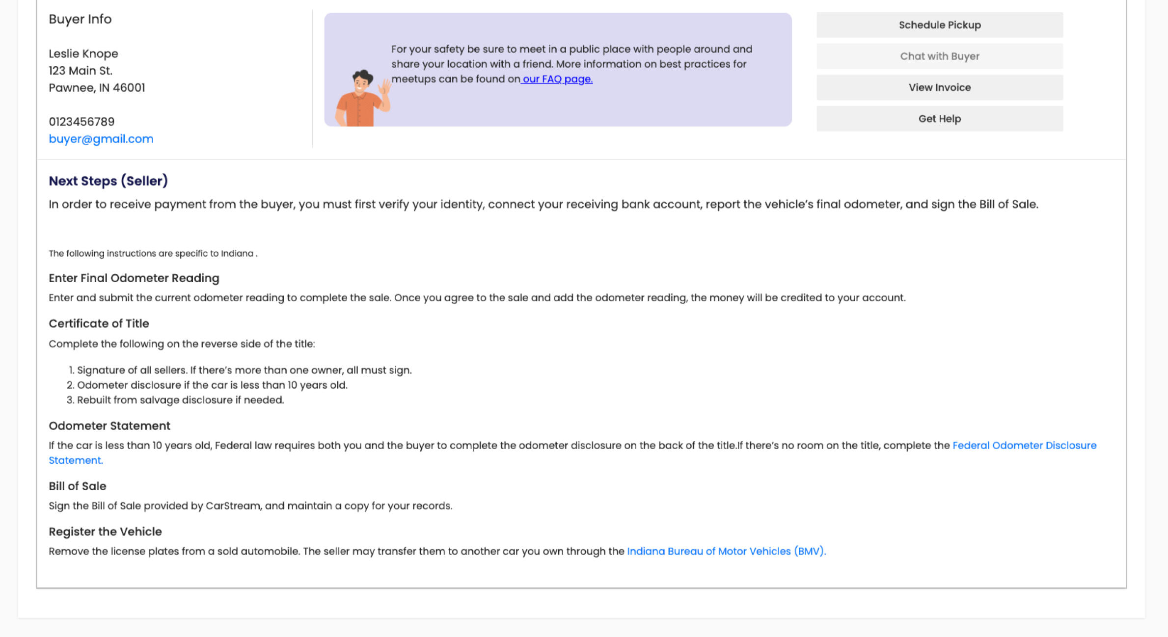
The vehicle pickup steps were defined in a list at the bottom of the screen, but the actions for them were in a different section. Additionally, all of these actions took place within a single button and popups (schedule pickup button in the image below).The second step towards providing clarity was to assess the pickup task flow for the buyer and seller, clearly define each step, and smooth out any bumps along the way.
Task Flow 1
Communicating timing
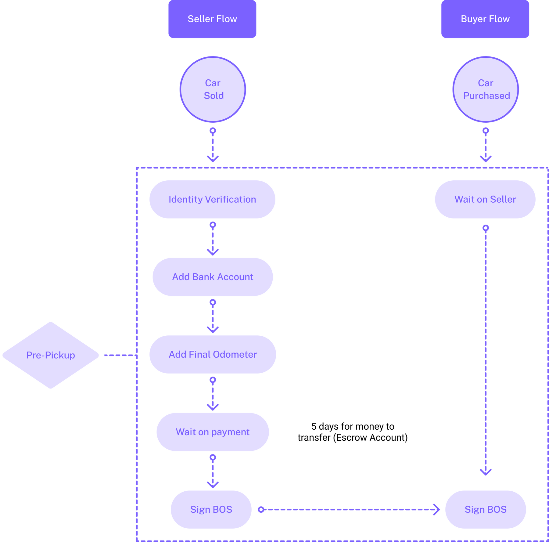
I began by taking some time to establish all of the steps required of each user on a task flow chart. After doing this, it made sense to divide this chart into 2 sections, pre-pickup and pickup.During pre-pickup, the task burden is primarily on the seller and the buyer is waiting until it's their turn to sign the Bill of Sale.After consulting the CEO, I discovered that the buyer's funds must sit in the Carstream Escrow account for 5-7 days before being transferred to the seller. This means the Buyer could be waiting for a week for their turn to sign the BOS after purchasing the vehicle. It's paramount that this is communicated clearly.
Task Flow 2
Connecting the users
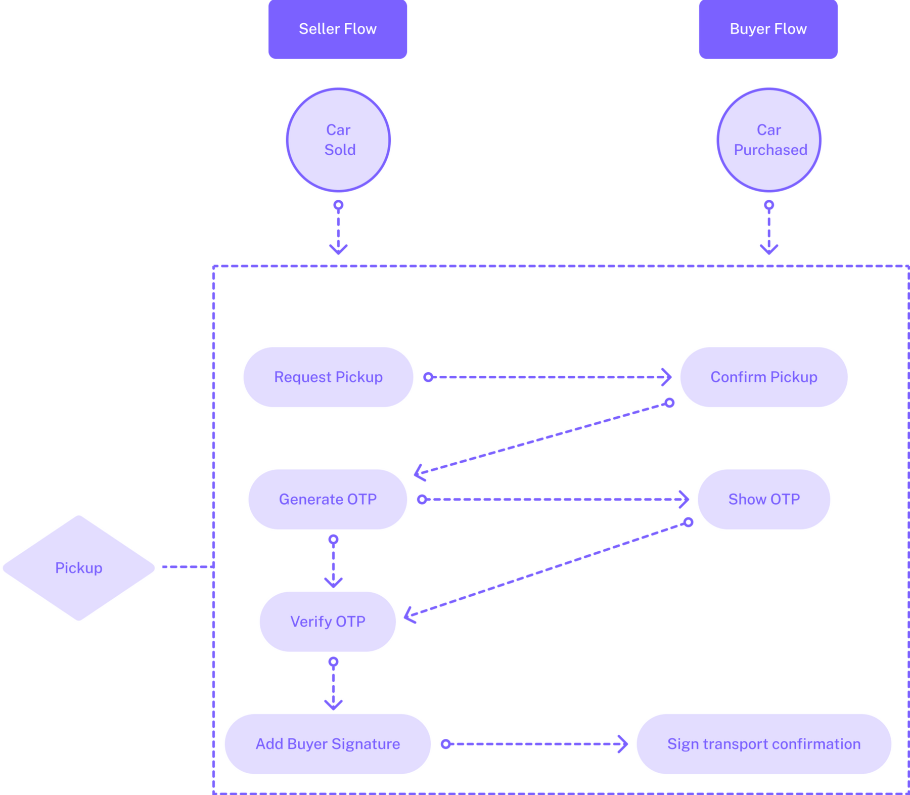
With the preparations done, the pickup section of the task flow chart is all about bringing the buyer and seller together to exchange the keys, a (hopefully) much quicker endeavor.The first step is finding a time for pickup that works for both users, one that will require careful consideration to ensure that a time can be found quickly and easily.From there, the remaining steps are completed on-site during the specified pickup time, which is why these screens must be mobile-friendly.
Whiteboarding
Making it dynamic
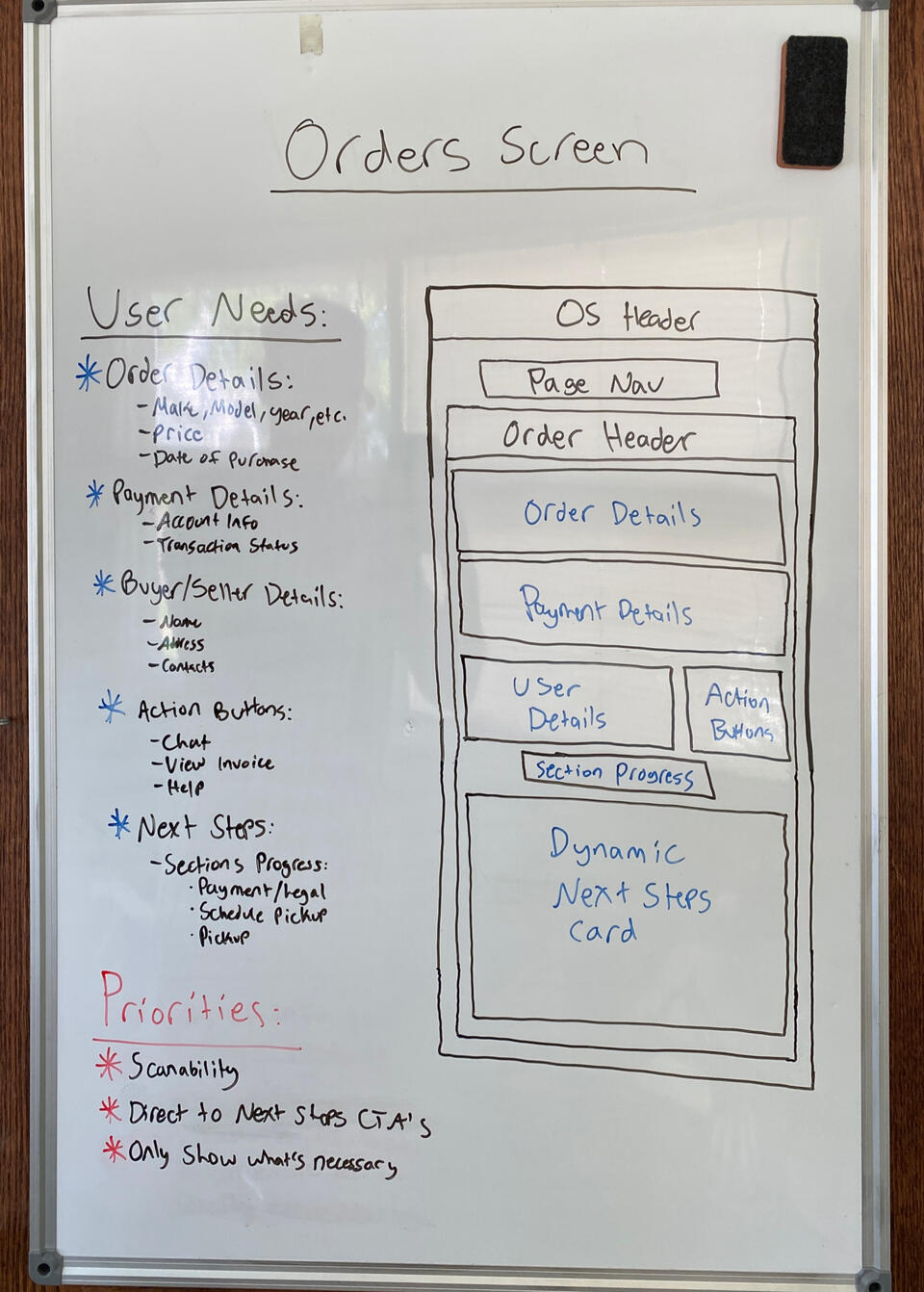
After establishing all of the steps in the task flow chart, I returned to the whiteboard to ideate how to best display them alongside the rest of the details on this screen.It made sense for there to be a progress bar that showed the users what step they were on and where that step was in the context of the pickup process.Below this progress bar would be a dynamic content card that showed the actions and instructions for each step. This ensured that each step was properly separated, clear, and had the necessary instruction.
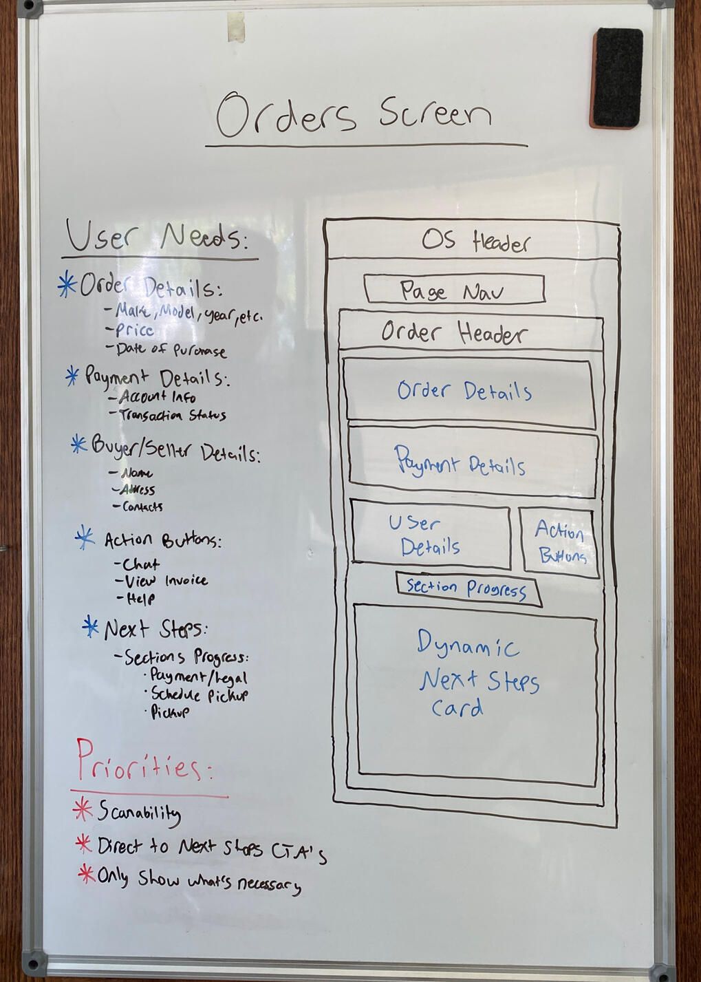
Design execution
Order layout, refined
I assembled the order details, payment status, order actions, and next steps sections inside the order accordion to form the new information architecture. This updated layout not only increases the clarity of each section but it's also optimized for mobile use. Try scanning the QR Code below to open this page on your phone and see the new mobile view inside the order accordion!

Part 3
Designing the pickup steps
With the order accordion condensed and the pickup steps clearly defined, it was time to design the actions and instructions for each step of the process.The third step towards providing clarity was to rethink how to display the pickup steps and how to provide the right instruction so that both users understand what's being asked of them.
Iteration 1
Verifying user identity
According to the task flow that I defined, the first step after a vehicle is purchased is for the seller to verify their identity. This is a step that Carstream requires all users to complete before keys can be exchanged, and the buyer already did it during checkout.Carstream integrates an online identity verification service from Plaid that uses your phone, so this screen needed to prepare the seller for that by telling them what they were about to do and why they needed to do it.For the buyer, this screen needed to communicate that there was nothing that they needed to do other than wait for the seller to complete their steps.
Iteration 2
Connecting the bank
The second step for the seller after verifying their identity is connecting their bank account for the buyer's payment to be sent to. Carstream uses Plaid to securely connect the user's bank account to the platform.Once the bank is connected using Plaid, the seller must select that account to receive payment and continue to the next step.For the buyer, this screen needed to communicate that there was nothing that they needed to do other than wait for the seller to complete their steps.
Iteration 3
Confirming the odometer
The third step for the seller after connecting their bank account is confirming the odometer. This step is crucial because if the final mileage doesn't fall within the range that the seller specified in the listing, then the buyer will be given the option to renegotiate the price or cancel the transaction altogether.After entering the mileage, the seller must provide their signature so that they can be held accountable if the actual odometer doesn't match their statement made here.For the buyer, this screen needed to communicate that there was nothing that they needed to do other than wait for the seller to complete their steps.
Iteration 4
Signing the bill of sale
The fourth step for the seller after confirming the odometer is signing the bill of sale.As described while explaining the task flows, the buyer's payment must sit in escrow with Carstream before the seller can sign the bill of sale, so this screen must communicate that to the seller while they wait to sign it.For the buyer, this screen needed to communicate the same message that the seller received up until the point when it's their turn to sign the bill of sale. At that point, they will be able to sign and move on to the next step.
Iteration 5a
Scheduling pickup
The first part of the final step for both users is scheduling pickup. The scheduling component needed to be designed such that the buyer and seller could easily and quickly find a date and time that works for both of them.I designed the schedule pickup card to allow the user to select a date and time and then send it to the other user as a request. To account for user error, any request can be rescheduled by the sender until the receiver responds to it.When receiving a request, the user can either confirm that day and time or reschedule it and send a new request back to the sender. If a request is rescheduled, it will be sent back and forth until a request from one user is confirmed by the other.
Iteration 5b
Picking up the vehicle
The final step of this process is picking up the vehicle. Once it's the scheduled date and time, the seller's screen will change to allow them to generate and enter a verification code that only the buyer can see. This ensures that each person is who they say they are and no fraud is taking place.Once the code is verified, the seller hands their phone to the buyer to sign the pickup confirmation to hold the buyer accountable for pickup in case anything goes awry.The moment that the buyer's signature is added, a member from the Carstream team will call both users to confirm that pickup has taken place and that everything is done. After that call, pickup is complete and the users can go their separate ways.
Design execution 1
Handing over the keys, reimagined
I added each of the above content sections into their respective steps in the process for the seller's view. The result was a screen that provided clarity and instruction on the pickup steps for the seller of the vehicle. Try scanning the QR Code below to open this page on your phone and see the seller's view on mobile!

Design execution 2
Receiving the keys, reimagined
I repeated the same process for the buyer's view that I did for the seller's view. The result was a screen that provided clarity and instruction on the pickup steps for the buyer of the vehicle. Particularly in the steps of the process that required the buyer to wait for the seller to complete their part.
reflection
What I learned
Some of the normal steps in the design process such as user testing and impact analysis had to be omitted due to this client being at the pre-seed stage and not having any recurring users yet. Despite this, I was able to learn about how to provide clarity to a complex experience. Here are some of my main takeaways:- Less is more. Sometimes the simpler solution is the better one
- Colors are powerful. Using colors wisely can lead to clearer calls to action
- Context is key. In a complex task flow, show the user where they are in the journey
- Set expectations. The user doesn't know the timeline unless you communicate it
- Mobile-first. This approach is ideal if you know users are on the moveMy one objective going into this project was to provide clarity to the vehicle pickup experience. I would argue that I succeeded in that objective based on the resulting designs. However, I have a conflict of interest being the one who designed them, so I'd like to hear from you! Below is the link to a copy of the Figma file, check out the designs and leave some comments. Point out my mistakes and ask questions, it's how I learn! If you want to talk more about my work, send me an email at [email protected].
Taking Gift Cards Digital
Gift cards are a popular alternative to giving someone a purchased gift or regular cash. However, they have some inherent downfalls that inhibit the ideal user experience: They're easy to forget at home, have balances that are hard to keep track of, and often go without being fully used.How can the user experience of gift cards be improved using a gift card wallet app — leading to more gift cards being used, balances that are easier to track, and less wasted money for the consumers?
overview
The client and my role
Card Genie is a business idea inspired by my wife, Emily, who initially introduced me to the problems that she experienced with gift cards and her idea for a mobile app to solve them. It began as an exploratory product design project for this portfolio, but I decided to continue the project for my senior capstone in Ball State's Entrepreneurship Program. To see an update on where Card Genie is now, click the button below to visit the website!Scope: Research, design, and testing of a hi-fi mobile app prototype
Stakeholders: Myself, my wife, and the users that I conducted tests with
Duration: June 2023 - April 2024

objective
The "why" behind the project
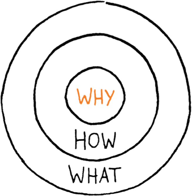
Going into this project, I had one objective in mind on behalf of the end-user:To simplify and enhance the gift card user experienceA well-designed gift card wallet app can lead to more gift cards being used, balances that are easier to track, and less wasted money for the consumers.
Part 1
Discovering the user
Before designing a gift card wallet app, I needed to gain an understanding of the users of gift cards so that I could style it according to their attributes and preferences.The first step towards simplifying and enhancing the gift card user experience was to conduct user research and compile the results into user personas.
User Research
Using traffic analytics
To gain insights into the users of gift cards, I used Semrush to get an in-depth look at the traffic analytics of four of the most popular gift card websites: raise.com, cardcash.com, cardbear.com, and giftcardgranny.com.Using Semrush, I was able to view data on the traffic to each of those websites as well as information about the users creating that traffic. Click on the image gallery to the right to enlarge a handful of the statistics, charts, and graphs that I downloaded from Semrush.
Data analysis 1
Making connections
I analyzed the data that I downloaded from Semrush to connect the dots between the visitors of those four websites and the similarities that they could share. There was overlap in the demographics, socioeconomics, and behaviors of the usersAs shown in the gallery on the right, I was able to calculate some averages about the users based on the data from all four sites. For example, 52%-57% of the users were female, which averaged out to 52.25% of the users being female.
Data Analysis 2
Defining the personas
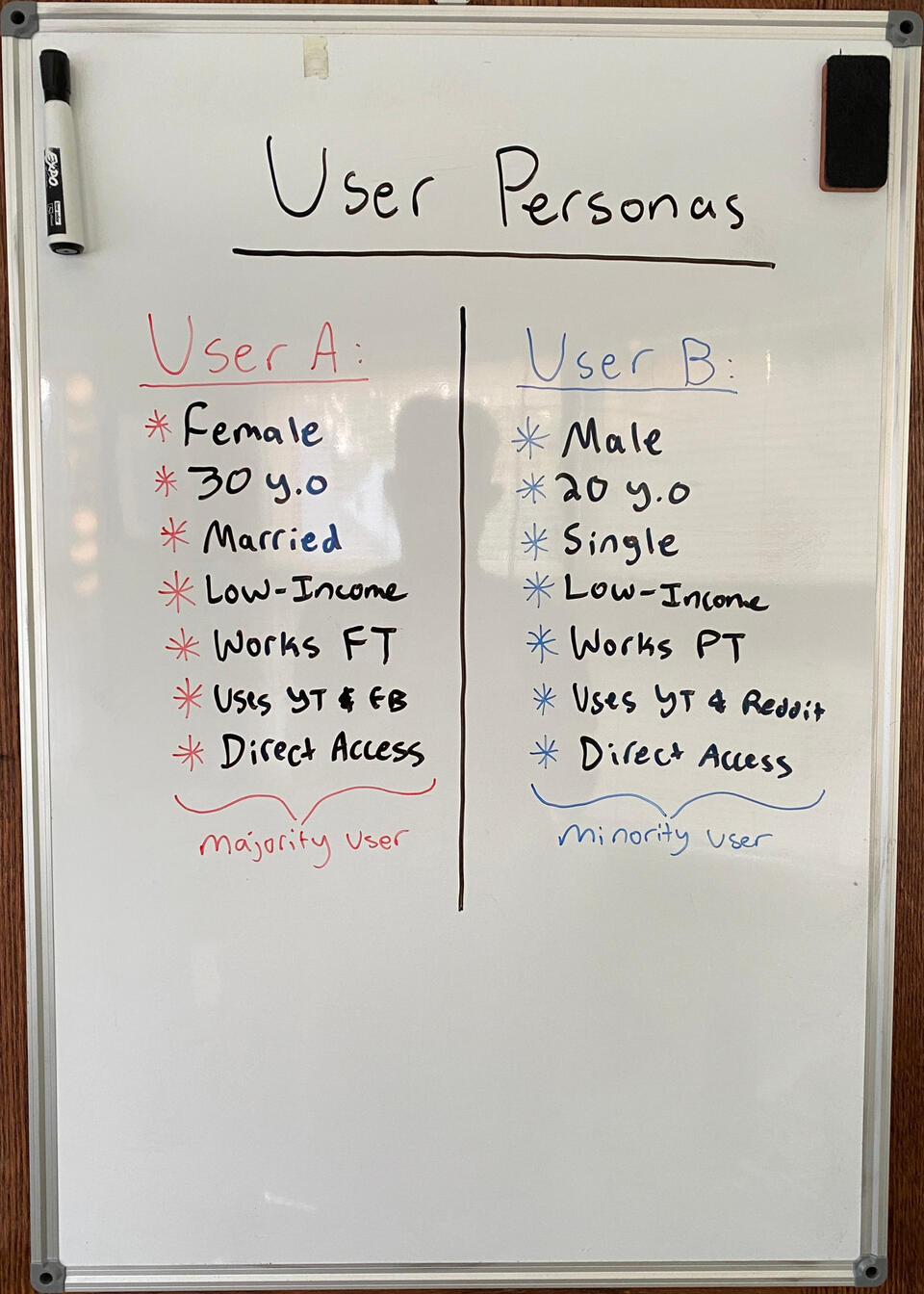
Based on the averages that I calculated, I created two basic user types. User A represented the majority of users, and User B represented the minority of users.Based on the previous example of 52.25% of the users being female, User A would be a female and User B would be a male. Another example is that 56.25% of the users are 25-45 years old, so User A would be 30 and User B would be 20.I chose to create the user types in this way so that I could directly target the majority of users, without ignoring the other users that aren't represented by the majority statistics.
User Personas
Bringing the personas to life
I took the basic user types that I defined above and expanded them into detailed user personas. Creative liberty was taken beyond the Semrush data to help bring the personas to life. The goals and frustrations are based on desires and complaints of gift card users that I talked to, but that data is qualitative and may not apply to all users.
Part 2
Designing the prototype
After gaining an understanding of the users of gift cards, I needed to create a prototype of what the app could look like and how it should function.The second step towards simplifying and enhancing the gift card user experience was to design a prototype of the app that solved the problems that gift card users face.
Ideating
Listing the features
The problems with gift cards are that they're easy to forget at home, have balances that are hard to keep track of, and often go without being fully used. The features of this app should solve those problems in a way that simplifies and enhances the gift card user experience.The features listed are in no particular order, just the results of a brainstorming session on how to solve the problems with gift cards. After coming up with this list, it became clear that certain features are more important than others and should be focused on first.
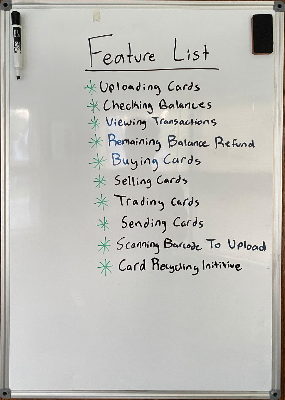
Whiteboarding
Sketching the layout
The most important features of this app are uploading cards, checking their balances, and viewing their transactions. I sketched a wallet screen that would contain the card information as well as the button to upload a card to the app.Many of the other features in the list are all related to exchanging cards in some way, so I decided to group them all into one screen called Marketplace with each feature having its tab that the user can toggle between.The last feature on the list that I wanted to sketch out was the card uploading screen. I figured there has to be a way that you can scan the barcodes on these cards and upload them automatically, so I sketched out what that could look like.
Moodboard
Finding inspiration
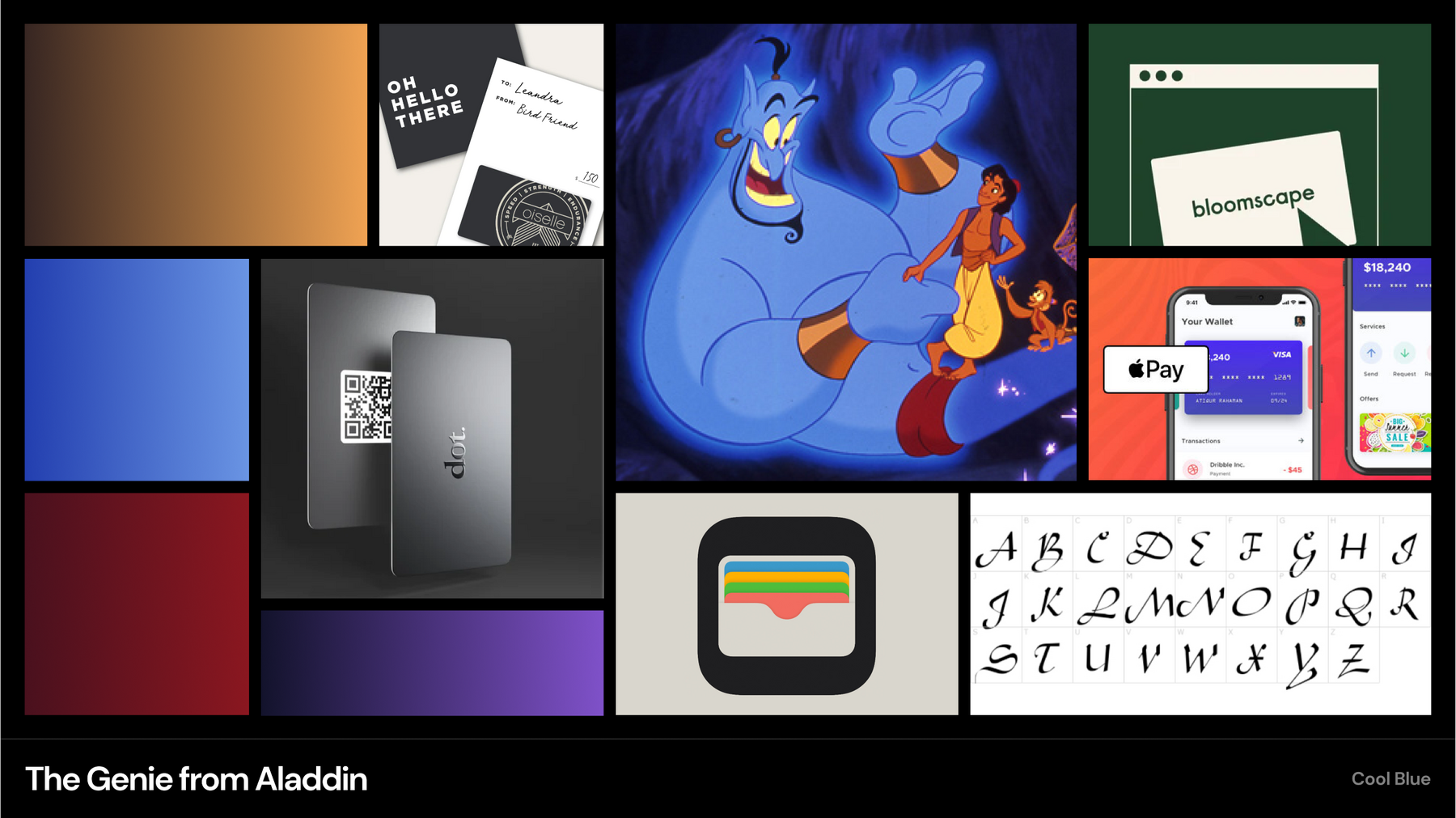
During the ideation process, I was also thinking of what to call this app, and one of the names that I came up with was "Card Genie".This one stuck with me because I felt like it captured the purpose of the app, catered to the user personas, and was distinct from any of the existing competition.After choosing that name, I created a moodboard of images, text, and colors inspired by Genie from Disney's Aladdin movie.
Style Guide
Setting the styles
In the moodboard, I used the color picker to make color gradients from the image of the Genie. I decided to try using the blue as the primary and the gold as the secondary in the color palette.For the typography, I didn't want something as extravagant as the Aladdin font but wanted it to still represent that wispy character of the Genie. I chose Playfair Display for my title text and Lato for my body text.
Design Execution
Creating the first prototype
I combined the wireframes that I sketched with the style guide to create a basic prototype. It featured a 3 screen tab bar with each of the screens that I sketched during whiteboarding. Many of the buttons weren't functional yet and the animations weren't consistent, but it was enough to conduct a round of user testing.
Part 3
Reiterating the prototype
With a basic prototype designed, I needed to test it with users to see what worked well and what didn't. I need to see the users interact with it to understand what they need and how they intuitively want to get what they need.The third step towards simplifying and enhancing the gift card user experience was to test the prototype and reiterate it based on observation and feedback from the users.
User testing 1
Causing confusion
Using the prototype, I conducted my first round of user testing. In each test, I handed the prototype to the user and then observed them complete a set of tasks in the app that I would ask them to do.Based on my observations, the users struggled with the round buttons at the top of the wallet screen. For starters, they were uncomfortably small to press, and the users struggled to understand what each one did.Another pain point that I observed was understanding what the red text represented in each card listing on the marketplace screen.
Reiteration 1
Providing clarity
After the first round of user testing, it was clear that I needed to adjust the buttons on the wallet screen and the text on the marketplace screen.I increased the size of the buttons in the wallet screen and removed the transfer button because it's unnecessary when there's a separate marketplace screen. The goal is that the increased size of the buttons makes them more usable and understandable. I reworded the red text and added a buy button to each listing on the marketplace screen.New features added to this iteration include the ability to actually add and remove a card, giving the confusing buttons on the wallet screen a purpose.
User testing 2
Missing helper text
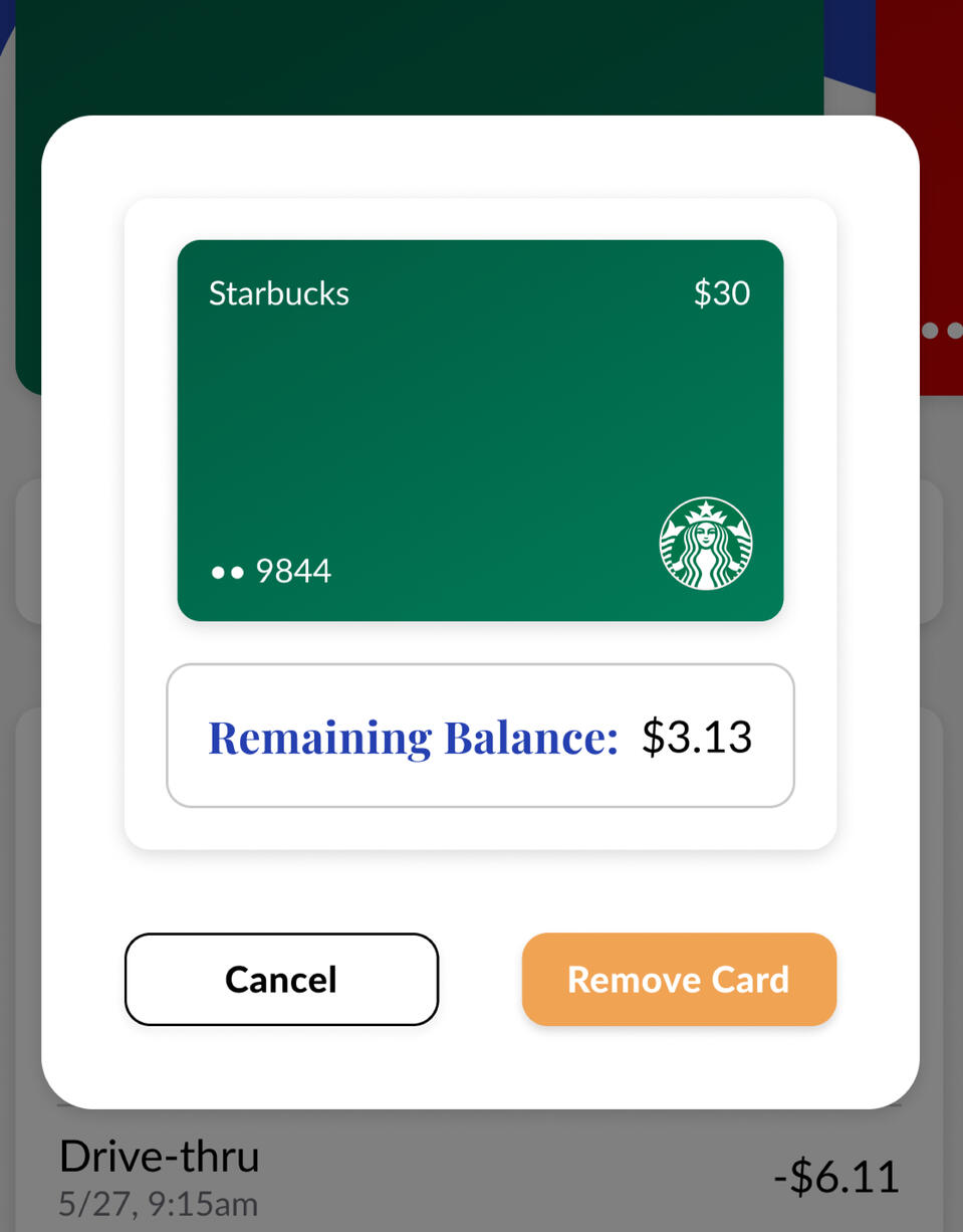
Using the second iteration of the prototype, I conducted my second round of user testing. In each test, I observed the user complete the same tasks as the first round, with the addition of adding and removing a card since that functionality was now present.The users understood what the round buttons did this round, so my change was effective. The discount text was also understood by the users.I received feedback after one of the tests that it would be helpful if there was some text on the remove card modal that reminded the user that removing a card can't be undone.
Reiteration 2
Giving context to modals
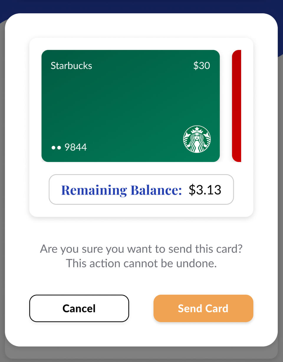
After the second round of user testing, I knew that I needed to add some kind of helper text in the remove card modals. If it was written correctly, it should provide the user with the right context to understand what they're doing:"Are you sure you want to remove this card? This action cannot be undone."I added matching helper text to the send card modal, which was a new feature added to this iteration to give functionality to the send tab of the marketplace screen.
User testing 3
Needing status updates
Using the third iteration of the prototype, I conducted my third round of user testing. In each test, I observed the user complete the same tasks as the first and second rounds, with the addition of sending a card to someone in their contacts list.The impact of the helper text in the modals was visible as the users had a better understanding of the action that they were taking in the modals.However, there was no visual indication that a card had been sent once that button was clicked and that caused confusion for the users. I needed to display some sort of message that communicated that the card had been sent successfully.
Design Execution
Gift cards, enhanced and simplified
To provide the proper responses to actions taken by the user, I added toast notifications throughout the design, as well as a notifications screen. The result was a user-tested gift card wallet prototype that stores your cards for you, shows you the balance on each of your cards, and allows you to sell your cards for cash.
reflection
What I learned
Since this project was for a new venture idea, I had a lot of freedom to start from the ground up with the design process and create something entirely new. I was able to fill in the experience gaps of my other projects by getting the chance to observe people use my prototype and apply those observations by reiterating the design. Here are some of my main takeaways:- Find the solution for your user, not the user for your solution
- Understanding the user persona can lead to ideal branding and positioning
- The first iteration shouldn't be perfect, just enough to get feedback from the user
- When testing: give the user a task, then observe how they try to complete it
- Let the users guide the experience that you're creating for themMy one objective going into this project was To simplify and enhance the gift card user experience. I would argue that I succeeded in that objective based on the resulting prototype. However, I have a conflict of interest being the one who designed it, so I'd like to hear from you! Below is the link to a copy of the Figma file, check out the designs and leave some comments. Point out my mistakes and ask questions, it's how I learn! If you want to talk more about my work, send me an email at [email protected].


